


Typeface designer Yumi Takata, who developed the UD Digital Textbook font, is seen in the city of Osaka on April 3, 2026. (Mainichi/Mayu Maemoto)
OSAKA — For children with low vision or learning disabilities, the typefaces used in conventional textbooks are hard to read. Many of them stumble at “reading,” the gateway to learning. The UD Digital Textbook font, a typeface developed based on the voices of those children, has supported many students’ learning since its release 10 years ago.
Known as the “miracle font,” it features the kind of soft roundness of writing rendered with a felt-tip pen, and the tips of hooks (hane) and sweeps (harai) in its characters are not too sharp. The font came into being from a “gap in society” found by one typeface designer.
Yumi Takata, 62, became interested in typefaces while studying at an arts junior college, and eventually joined a font maker. Her turning point came in 2007. While working on the development of universal design (UD) fonts that would be easier for more people to read, she met children with low vision.

The UD Digital Textbook font, bottom row, with easy-to-understand pen movement and reduced variation in line thickness, is seen in this image provided by Morisawa Inc. The other three fonts are, from top, the standard textbook font, the Mincho font and the Gothic font.
Parents and volunteers were copying textbooks by hand in large letters for those children. The children were reading and writing with their faces so close that their noses nearly touched the page. At the time, textbooks did not have typefaces that were easy for them to read. “This is a gap in society,” Takata felt. She decided to create a typeface that children could read easily.
With the cooperation of Yasushi Nakano, a Keio University professor who studies visual difficulty and barrier-free design, Takata began developing a new typeface while incorporating the opinions of people with low vision and volunteers who handcrafted enlarged textbooks.
She collected Japanese-language and handwriting textbooks, cut out and pasted each of their characters onto mount paper and continued her research. At times, prototypes drew harsh criticism, including that they “would not serve as models.” For example, she was told that the “rightward sweep” in the kanji for “tree” looked like a “stop” (tome), which would cause confusion when teaching kanji. Takata and the development team spent several months revising more than 1,000 kanji characters that included similar right sweeps.
As their research progressed, it gradually became clear what exactly the children were struggling with. Typefaces used in print do not necessarily match handwritten characters in their stops, hooks, sweeps and other elements. Some characters, such as those with the shinnyo radical, differ in shape depending on the typeface, and these confuse children who have just begun learning characters regardless of whether they have disabilities.
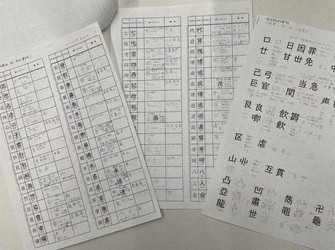
A chart on which typeface designer Yumi Takata, who developed the UD Digital Textbook font, cut and pasted characters one by one during her work and checked rules for character forms is seen. (Photo courtesy of Morisawa Inc.)
For children with low vision, typefaces such as Mincho, in which line thickness varies, are considered difficult because thin parts are hard to see and heavily blackened parts stand out, making the overall shape difficult to grasp. Among children with developmental dyslexia, a learning disability that affects reading and writing, there are cases in which thin, pointed sweeps feel frightening, or characters in thick-lined Gothic typefaces look like a single mass.
Takata refined the typeface while reflecting these voices one by one. After trial and error, it took about eight years to complete the font. The typeface she had nurtured like her own child was finally released in 2016.
The following year, it was included as standard in Windows 10, and in 2020 it was adopted by four textbook publishers. Its use has since expanded to Japanese-language dictionaries, learning materials and other products.
In spring six years ago, a woman rushed up to Takata at an education event. “Thanks to this typeface, my child has been able to engage with learning,” she said. As the woman expressed her gratitude with tears in her eyes, Takata thought, “How much hardship mothers must have endured.” Another mother also thanked her. Takata’s eyes welled up as she listened to the mothers’ stories.

Typeface designer Yumi Takata, center, speaks about the UD Digital Textbook font at Hattatuson Fes 2026 in Osaka on April 3, 2026. (Mainichi/Mayu Maemoto)
Takata now works to promote the UD Digital Textbook font at Osaka-based font maker Morisawa Inc. As digital learning devices are now being developed and the use of digital textbooks is spreading, she said, “If digital devices become widespread and each person can choose a typeface that is easy for them to read, I think that is true universal design.”
Easy-to-read characters can become a driving force that supports the desire to learn. Everyone is different, and everyone is good in their own rights. Today, the miracle font continues to gently push children forward.
(Japanese original by Mayu Maemoto, Osaka City News Department)
AloJapan.com