

Ever since humanity learned to write, we’ve used pictures to make reading easier, and now an exhibition looks at the evolution of the pictogram in public signs.
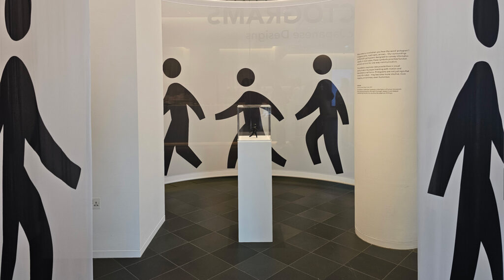
The exhibition, at Japan House, focuses mainly on how designers from Nippon Design Center created the first full set of sporting pictograms in 1964 for the Tokyo Olympic Games, which then went on to become the international standard for sporting events.
In 2019, the Nippon Design Center launched a new project, Experience Japan Pictograms, designed to enhance the experience of international visitors to Japan through a more comprehensive visual communication system comprising over 600 country-specific symbols.
It was to address the issue that the Japanese language is hard for people who are used to a Latin alphabet to readily grasp when visiting the country. However, with smartphone translators getting better every year, I am left wondering if language barriers will fade into irrelevance and render pictograms equally redundant.
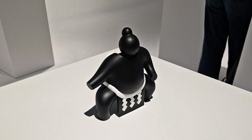
One of the cleverer ideas in the exhibition looks at what happens when classically flat pictograms are rendered in three dimensions. Some are works of art in their own right.
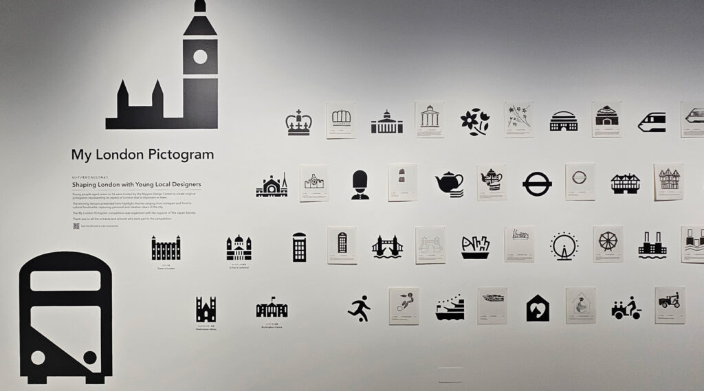
They also asked some London schoolchildren to design new pictograms for London. One of them was a pound sign, which I am going to decide was a pictogram for “yikes, it’s expensive in London”. Unlike the exhibition though, which is free to visit and open until November 2025.
It’s a mix of design, wayfinding and typography, so likely to appeal to a lot of people.
The exhibition, Pictograms: Iconic Japanese designs is at Japan House on Kensington High Street and is open until November 2025.
AloJapan.com